Cruel Rabbit was an assignment given to provide experience in designing brand guidelines. Of course, there was the creative curveball, instead of being able to choose our own names for the fictitious company we were given a random animal and a random adjective. We then built a company around that name. The project encompassed everything from the logo to any other elements we were inclined to design and mock-up. An Additional challenge was creating the copy and rationale to accompany our design decisions. In addition to the standards I developed, I have included some of the written branding guidelines!
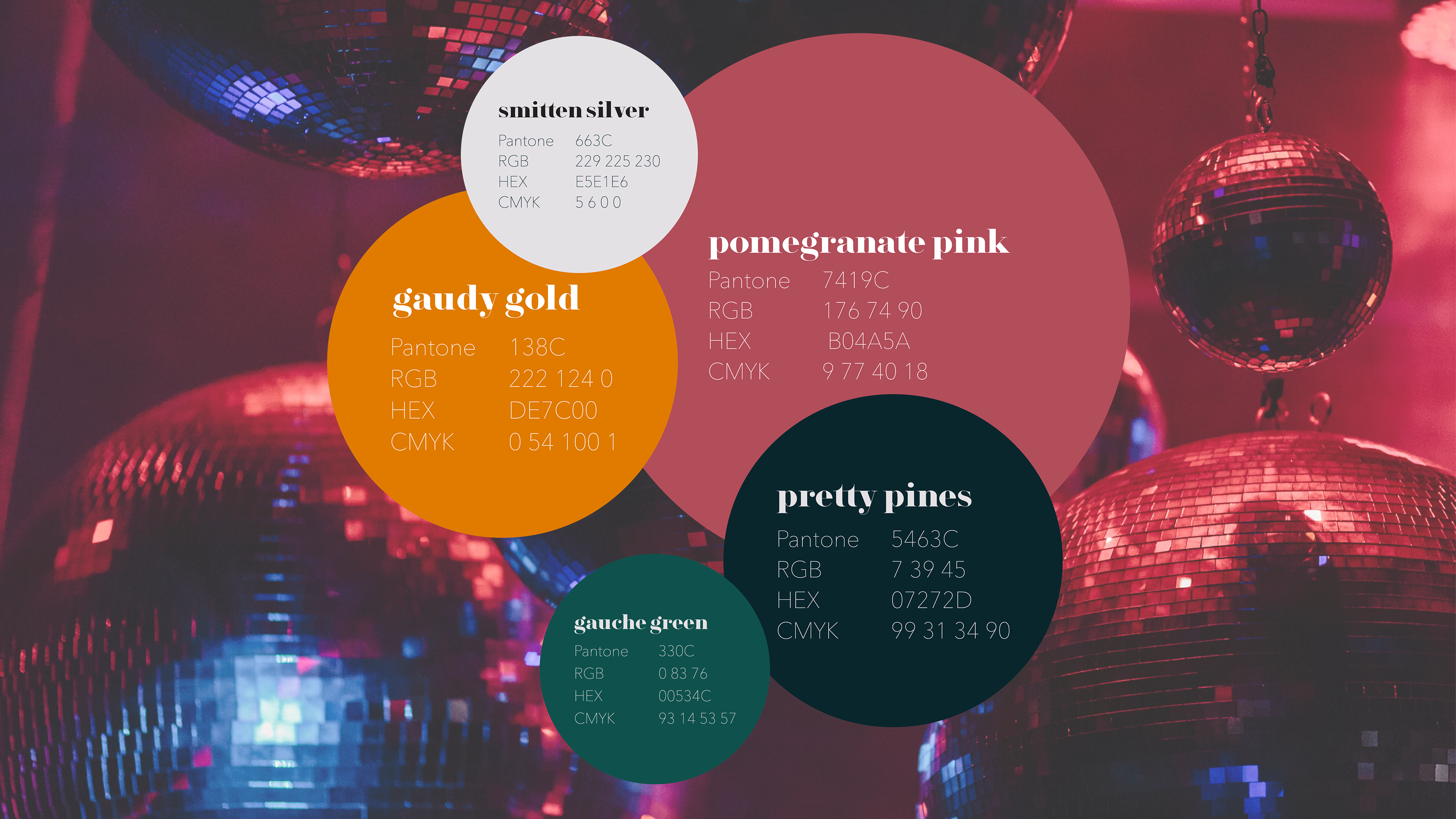
"Our colors blend together like our drinks, smooth yet strong. Moody, jewel-tone colors help show off our sassy personality. Our Primary colors are pomegranate pink, gaudy gold, and pretty pines. Pair our colors any way you’d like.
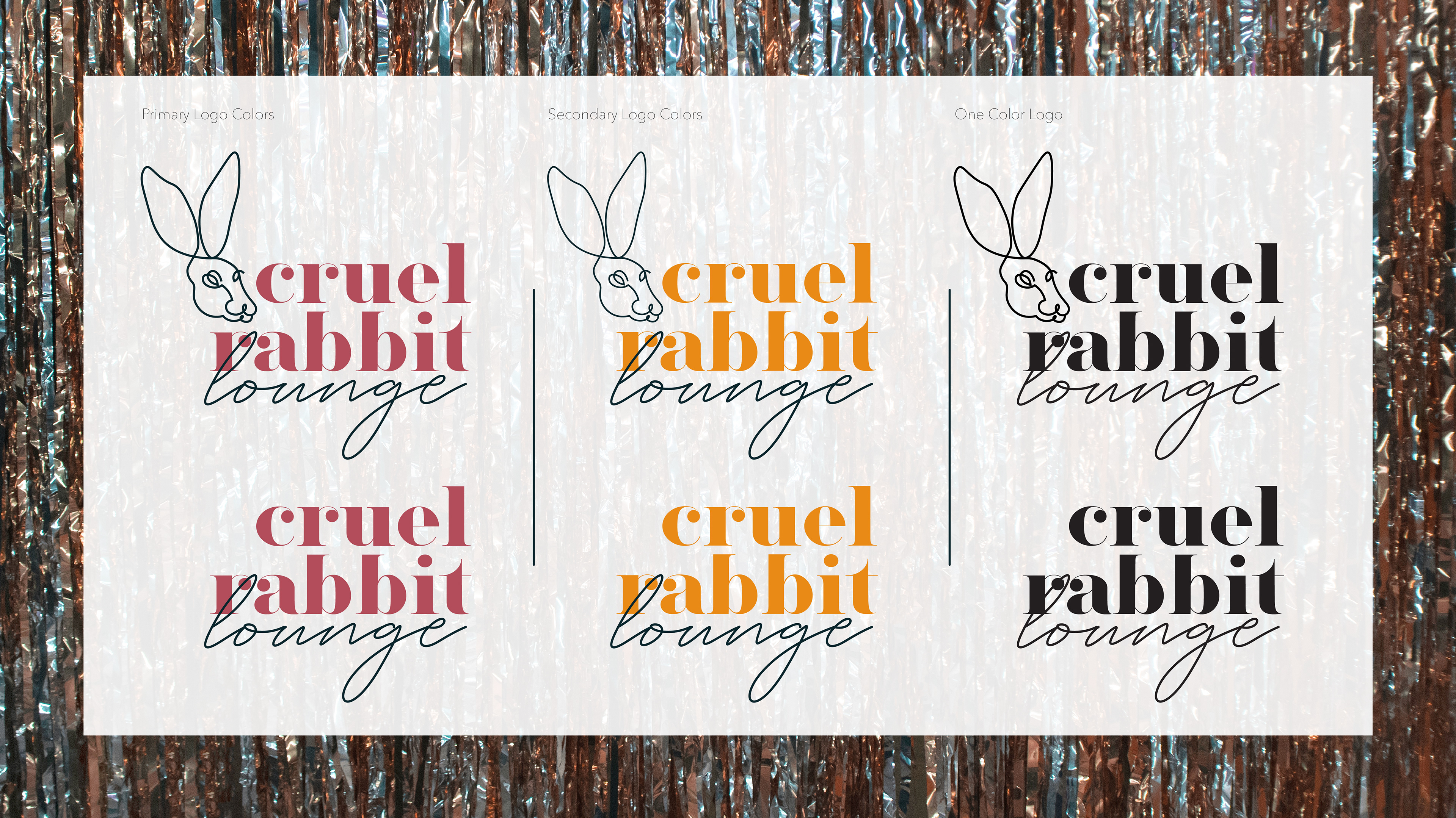
Brand Baby
"In this section, you’ll take a look at how we like to look, it’s important to only use products and items we have approved as branded. "
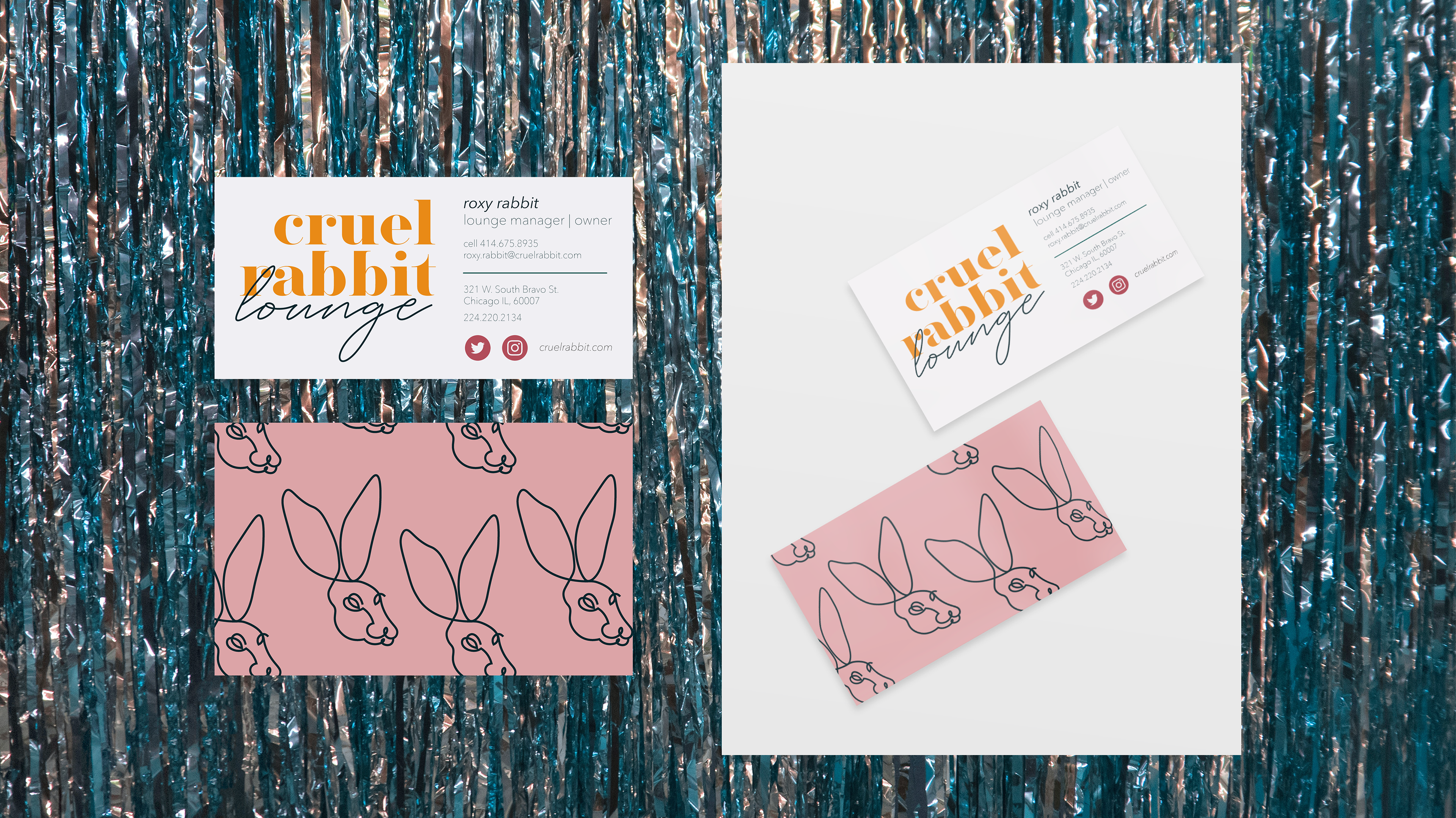
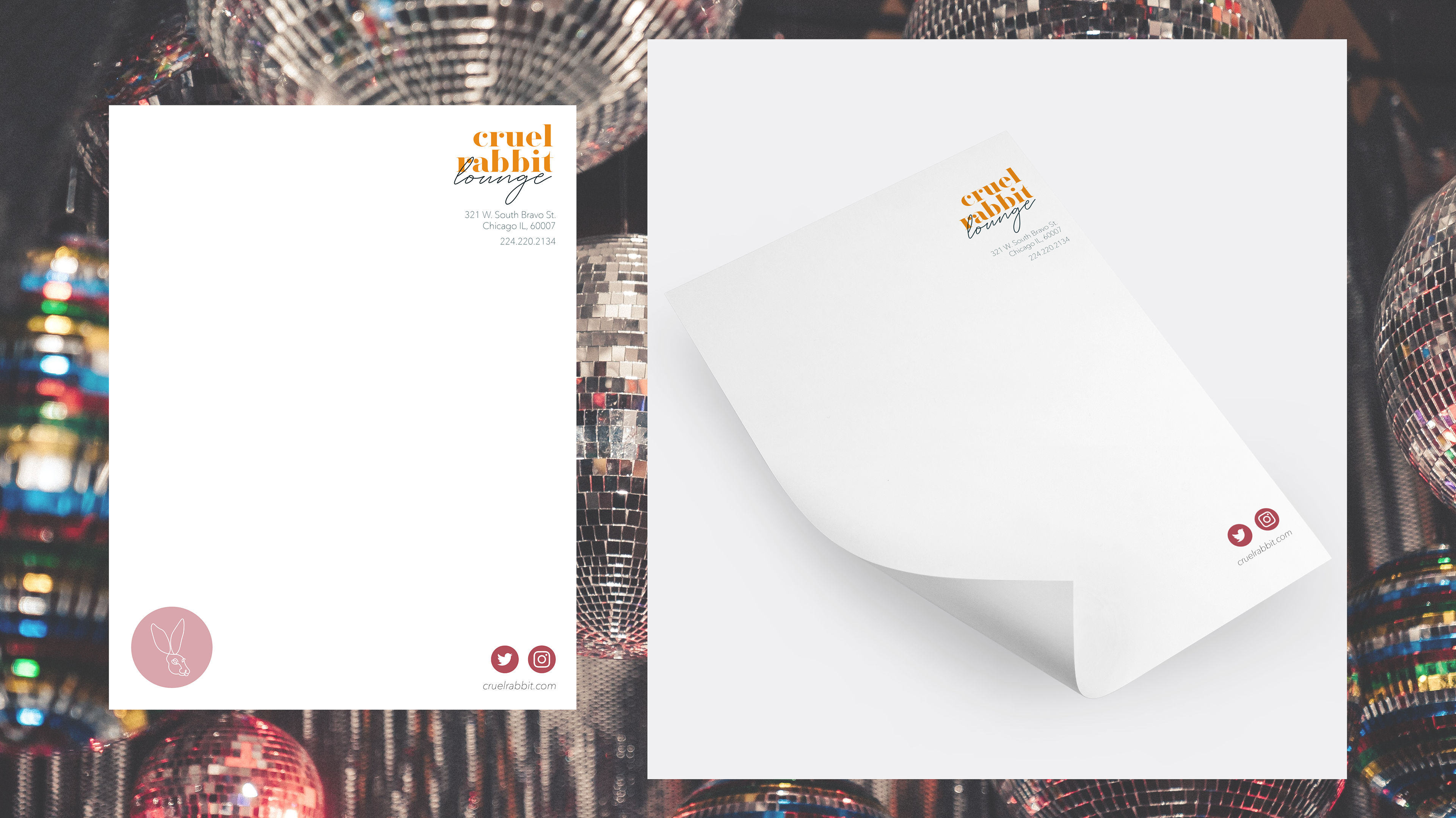
Stationery Suite
"Oh, so suite! This is our stationery suite, perfectly pomegranate pink so we stand out from the rest. Our stationery suite is designed to stand out, but remain on brand and keep Roxy front and center. When mailing, writing, and vibing we want you to roll with Roxy. If you ever need more, reach out to marketing they’ll be happy to help ya."